Introducing MalaysiaTraining.net
Course Category Browsing 2.0 Beta 2

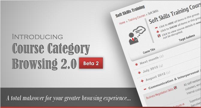
reetings everyone! Since the launching of our new business model, Internet Marketing for Training Providers (I'mTP) on 11 April 2012, we had made the publishing of the Public Training Programs possible through some of our corporate subscribers who are also the regular public program organizers. Since then, we began to aware that our earlier course category browsing layouts were no longer fitted into the new model. Therefore in early this month, we released our first beta in order to provide a quick resolution to cater for such need. The Beta 1 includes removing the Course Code column on each of our program listing pages in order for the Public Program column to fit into our limited page size. We found the presence of the Public Program column essential because we just can't expect our customers to click into each course detail page just to find out which training programs are available for the public to attend. Another major change in Beta 1 was to sub-categorize our long soft skills program listing as the number of courses had been growing since the launching of I'mTP. Without the sub-categories, finding a particular training program is like diving into the deep blue sea just to find a needle -- we just can't allow this to happen on our website. Therefore, we can say that the Course Category Browsing 2.0 Beta 2 (CCB 2.0 Beta 2) was actually being built on top of these two major foundations.
Our Design Concepts
In order not to confuse you and bored you down with too much text explanations, we've came out with the following graphical diagrams that will ease your understanding. Click on each thumbnail below to enlarge.
Our Design Philosophy
Every good design came from a careful thought, and every careful thought always came from the willingness to step back in looking at the whole picture while keeping in mind the ultimate goal that needs to be achieved -- this is the key. We always believe that by keep having our collective conscious mind up-and-running, the full picture of the final solution can always come into our mind faster than any other procedural design methods through our inspiration; then from our inspiration, we work backward just to further draw out the design details for communication and collaboration purposes.
The philosophy behind this design methodology is simple:
- To avoid complex and less-intuitive user interface design as a result of over analysis.
- The audiences are not part of your design team -- they'll never know the 'hidden reasons' of your design and they're not interested to know it.
- To simulate the audiences' natural behavior by emptying our mind.
In fact, we didn't come out with any technical design specification whatsoever but purely perform the direct coding based on the 'diagram' that stays inside our head all the time. We only came out with the above diagrams when we started to blog about this release just for the sake of simplifying our explanation to those who are interested to know more about it. Again, if the users need to go through this blog then only they'll know how to use our new interface, then it must be our great design failure.
Final Thought
However, regardless of how great that our web designing skills are, no one can please everyone except to hope for a greater satisfaction on a larger group. As such, we'll definitely welcome those who would like to feedback to us about their opinion for our future improvements. Of course, as the term 'Beta 2' implies, it's still not the end of our version 2.0 initiative. We still have a couple of other exciting good stuffs that we planned to develop, especially in the aspect of usability. Although some of it depend on our third party providers, e.g. our online forms, we'll either work closely with them to come out with better solutions or we'll go for other alternatives. We'll keep you posted once the next beta is released. Be sure to follow us on our social networks for more timely updates! See you soon!
Published by: , 25 May 2012


